Our national identity – Primary logo
The NHS Scotland logo is instantly recognisable, assuring people about the quality of care provided, free at the point of delivery. To protect public trust, it must be used correctly and only for NHS Scotland-funded services.
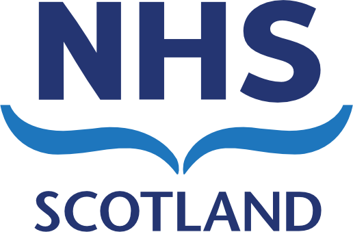
The NHS Scotland logo is a unique visual symbol that aids and promotes identifications and recognition. The primary logo is built on the foundation of three essential elements which also apply to the NHS Boards: the NHS initials, the caring hands device and the relevant geographic location – either the word ‘Scotland’ or relevant NHS Board area name to which the logo belongs.
The primary NHS Scotland identity should, wherever possible, be reproduced in: NHS Scotland Dark Blue (Pantone 288 C) and NHS Scotland Light Blue (Pantone 3005 C)
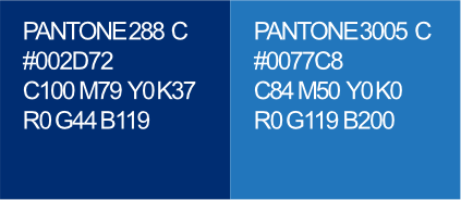
There is no requirement to update existing assets. However, the new logo (including the new NHS Scotland light blue) must be used when creating new or refreshed resources or materials.
Mono logo
To be used when the asset is produced in a single colour(black).
Reversed logo
When using the reversed logo version, please always ensure the background has sufficient strength to show the transparent version clearly on either a single solid colour, photographic or graphic background.
Caring hands symbol

The caring hands device represents our dedicated and hardworking staff, who are passionate about NHS Scotland’s ethos to help and care for others – a passion that extends to patients and the public, and each other. High quality care through teamwork, services, and partnerships is their priority.
The ‘caring hands’ device width should never be narrower than 23.5 mm. This will ensure 10pt text size at A6 which will enable better visibility, legibility and accessibility. On sizes A5 and above it should be used at 28 mm orlarger making the text at least 12pt.
Logo sizing
Consideration must be given to the size of the logo, follow the sizing guide shown here:
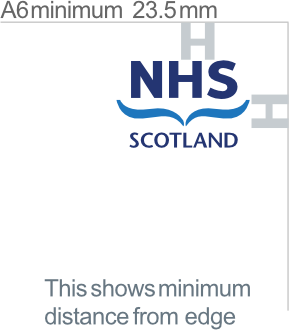
- Logo on A6 to measure a minimum of 23.5 mm wide (10pt text)
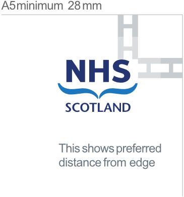
- Logo on A5 to measure a minimum of 28 mm wide (12pt text)
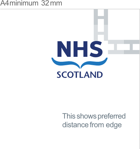
- Logo on A4 to measure a minimum of 32 mm wide
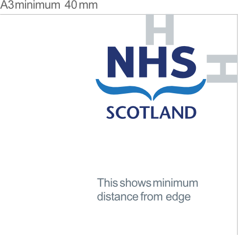
- Logo on A3 to measure a minimum of 40 mm wide
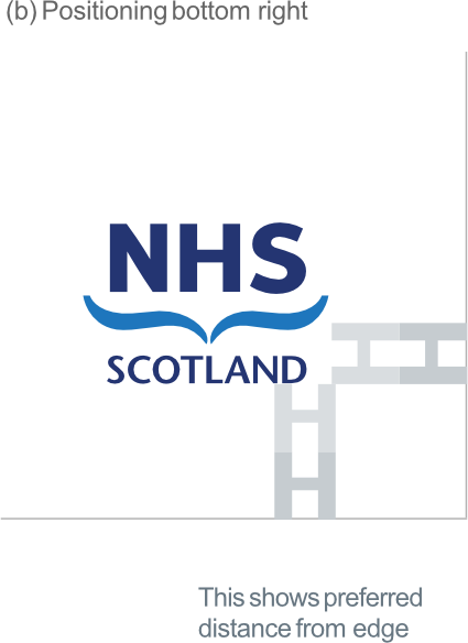
Please ensure the logo is not too close to the edge of the page. The preferred distance is defined as 2x the height of the H in the NHS. The minimum distance is 1x the height of the H.
Exclusion zone
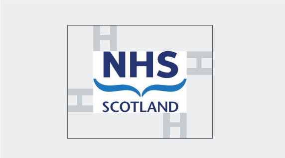
When using the NHS Scotland logo or an NHS Board logo, a clear area in which nothing else should appear should always be maintained around the logo.
This ‘exclusion zone’ is designed to allow the correct amount of space around it to ensure standout and to promote a clear and confident layout. The exclusion zone is defined by the height of the H in the NHS.
Minimum sizing guide
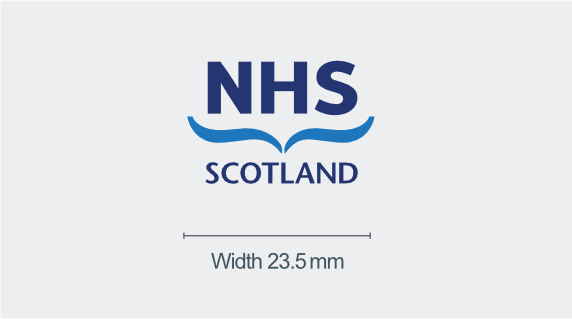
The NHS Scotland logo is accessible against WCAG AA criteria, and must adhere to the minimum size guidelines on a white background, the width should be no smallerthan 23.5 mm making the text 10pt at A6.
On sizes A5 and above it should be used at 28 mm or larger making the text at least 12pt.
Logo positioning
Consistent placement of the logo is essential to maintaining the integrity, visibility, and recognition of the NHS Scotland brand across all communication channels. The following standards apply to the positioning of the NHS Scotland and NHS Board logos:
Primary and Secondary Positions
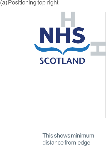
(a) The primary logo position is the top right corner.
(b) The secondary logo position is the bottom right corner.
These positions are designated for all materials where the NHS is the lead or sole organisation delivering services. The NHS Scotland and NHS Board logo must not be displaced from these positions in such cases, unless format constraints make it impractical.
Tertiary Position
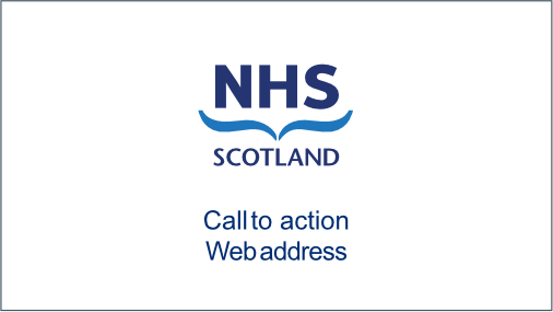
A tertiary logo position, typically centrally aligned, may be used in the following specific contexts, where standard top or bottom placement is unsuitable:
- Film or animation end credits
- Flags or banners
- Commemorative plaques
- Branded promotional items
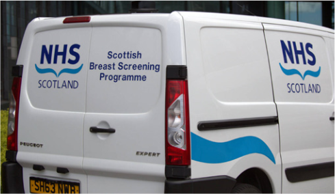
- Vehicle livery
Central positioning in these scenarios is permitted to enhance visibility and proportional balance, provided it complies with NHS Scotland’s visual identity and sizing guidelines.
NHS Scotland logo on websites
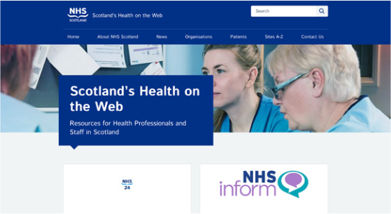
Primary position – top right.
Secondary position – top left.
Partnership Materials
Where NHS Boards are operating in partnership with other organisations, the NHS Scotland logo must be placed as close as possible to its primary or secondary positions, while maintaining visual balance with partner branding. Placement should avoid diminishing the NHS’s role as a core or co-delivery partner.
Usage on different backgrounds
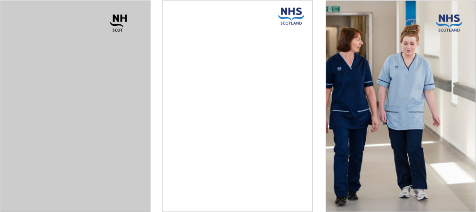
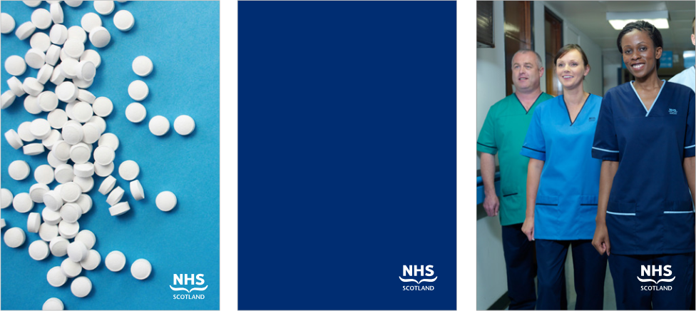
The preferred background for the NHS Scotland logo is white. However, where this is not possible, the examples shown illustrate backgrounds that are acceptable.
Logo misuse
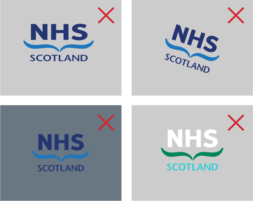
Our identity and the elements within it have been carefully considered. No part of the identity can be changed or altered in any way. Consider all these points when applying it.
Distortion – do not change the proportions of the identity to distort it in any way
Rotation – do not rotate the identity
Contrast – ensure all element s of the identity are clearly visible when positioned on a solid colour
Colour – do not alter the colours of the identity in any way (see ‘Colour’ guidance).
It is not permissible:
- to modify or create a new NHS Board logo or variant
- to create sub-identities for NHS Boards, regardless of whether this is designed to represent an individual directorate, division, department, team, service, initiative, or any other individual part of an NHS Board or NHS Board organisational partnership
- to lock the logo up with any other partnership logo or wording; always observe the logo exclusion zone (equivalent to the height of the letters ‘NHS ’ in the logo).
All other identities within NHS Scotland should be phased out and no new, alternative identities developed.
NHS Scotland Identity – Logo Structure
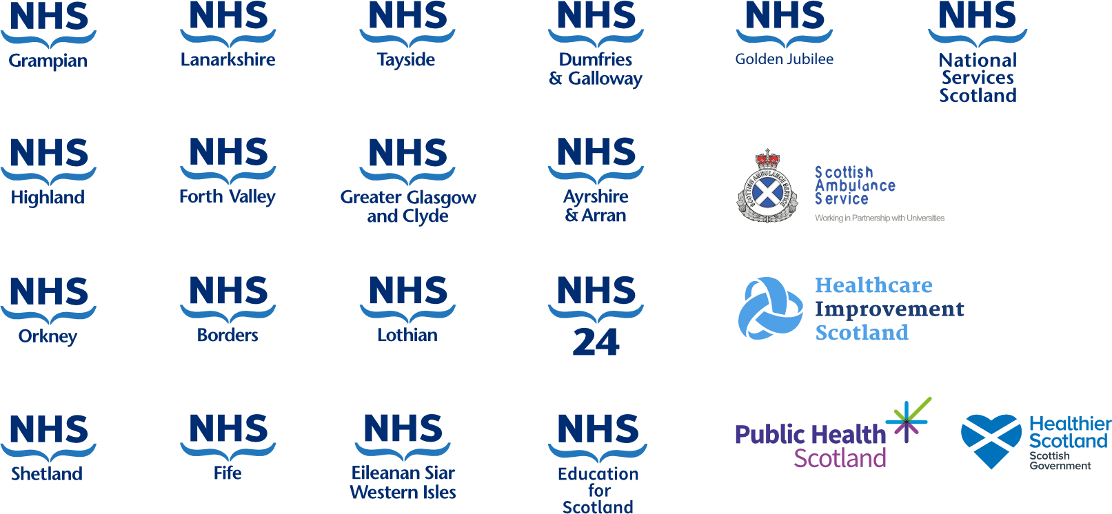
NHS Scotland organisational logos
Logo structure
When more than two NHS Boards are involved in a joint initiative the default branding should be NHS Scotland.
Partnership logo

The Partnership logo is a recognisable variant of the NHS Scotland logo suite.
The logo is accessible against WCAG AA criteria, and must adhere to the minimum size guidance on a white background. To ensure visibility, legibility and accessibility, the ‘caring hands’ device should never be used narrower than 37.5 mm (a). This will keep the ‘In partnership with’ text at a minimum of 12pt for printed documents.
Primary care logo
Primary care contractors, who deliver NHS Scotland-funded services under nationally agreed contracts, are permitted to use the NHS Scotland primary care contractor logo.
The logo is accessible against WCAG AA criteria, and must adhere to the minimum size guidance on a white background. To ensure visibility, legibility and accessibility, the ‘caring hands’ device should never be used narrower than 40 mm. This will keep the ‘Providing services for’ text at a minimum of 12pt.
Dual Language Logos
A dual language (English-Gaelic) logo variant has been created to support NHS Boards who wish to make Gaelic visible and audible across the communities they serve.
Permission to introduce a dual language logo is granted by the Scottish Government based on the criteria within the NHS Brand Policy.
The NHS Scotland parent brand identity will not adopt a dual language logo at this stage.
The dual-language (English-Gaelic) logo should be with English first, followed by Gaelic wording underneath.
The dual language Gaelic logo should, wherever possible, always be reproduced in full colour using the NHS Scotland Dark Blue (Pantone 288) and NHS Scotland Light Blue (Pantone 3005).
Gaelic wording must be in NHS Scotland Light Blue to meet accessibility standards with the exclusion zone guidelines applying as per the primary NHS Scotland logo.
The NHS Highland logo is shown for reference.