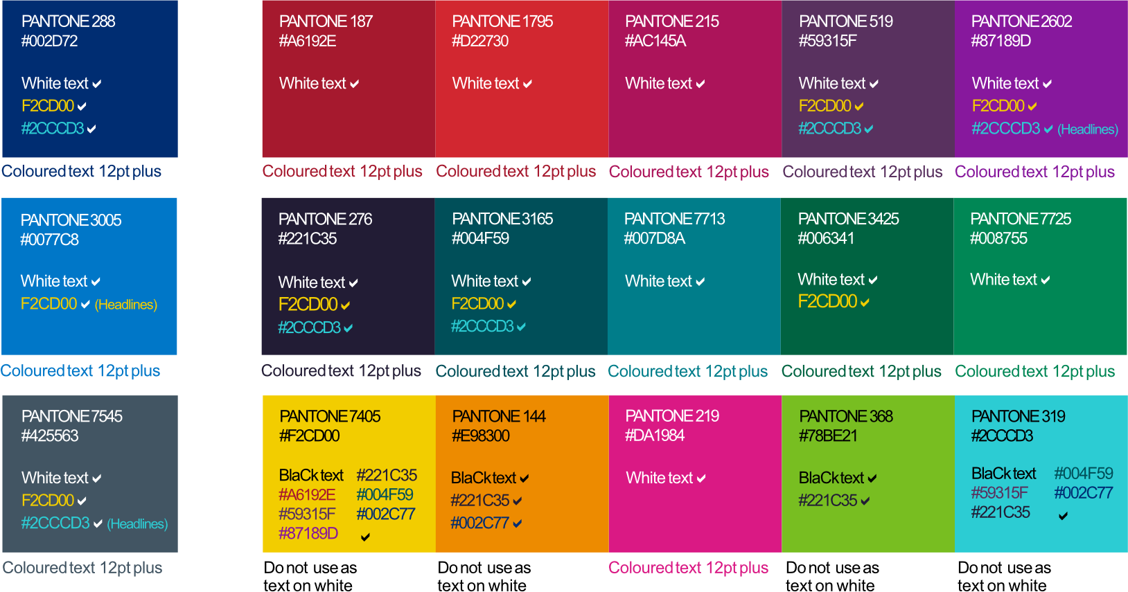
The brand colour palette has been carefully considered to help build trust and reassurance by helping people recognise NHS Scotland organisations and services. They also have an important part to play to bring attention, interest and personality to our communications. The colour palette should be used consistently across all communications and media platforms (both print and digital) and adhere to a minimum WCAG AA accessibility criteria. No other colours should be used or added to the colour palette.
There are three ranges of colours:
- Primary,
- Secondary and
- Accent.
Primary
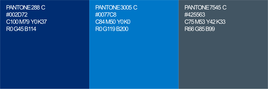
The primary range are based on our logo and is seen as more corporate. Pantone 2995 C is replaced by Pantone 3005 C for accessibility purposes when in general use. In addition a dark grey has been introduced as an alternative to black as it is less harsh and warmer in tone.
Secondary
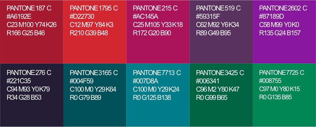
The secondary palette should be the first choice to add interest and personality to your communications. Please always check accessibility and contrast in your application.
Accent
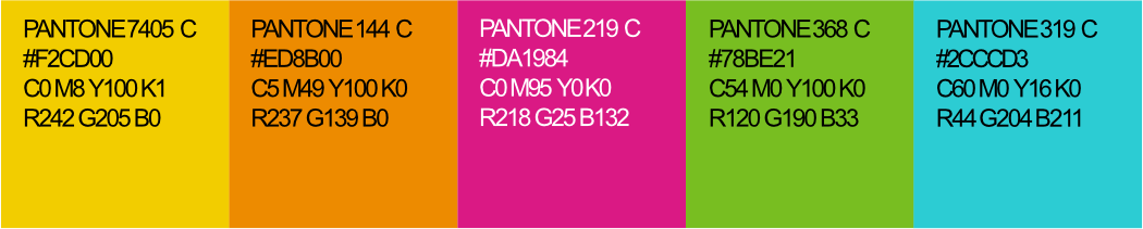
Finally we have a range of accent colours. These should be used sparingly and not used to convey important information. Do not use them at over 20% of page area.
Text colour combinations – to ensure legibility there are certain colours which can be used fortext on black/white and coloured backgrounds.
Percentage tints of all colours are allowed where necessary but please ensure any overlaid text is legible within WCAG AAA accessibility criteria. Black, white or our corporate grey are preferred in this case.
To check your combinations please use a colour contrast checker such as https://contrastchecker.com.
Colour contrast guidance
Colour combinations shown are the only acceptable combinations where text is used. Please ensure all body text or any smaller text is 12pt and over.